We are using FNC Charts in a web application, and we had some questions about your development plans for FNC Charts.
First, when I create a demonstration chart with some random data in it, I am seeing that there is some lack of smoothness in the lines that join the points. I am not sure if you will be able to see it in the screen image I have included here, but I have indicated with red arrows the effect that I am describing.
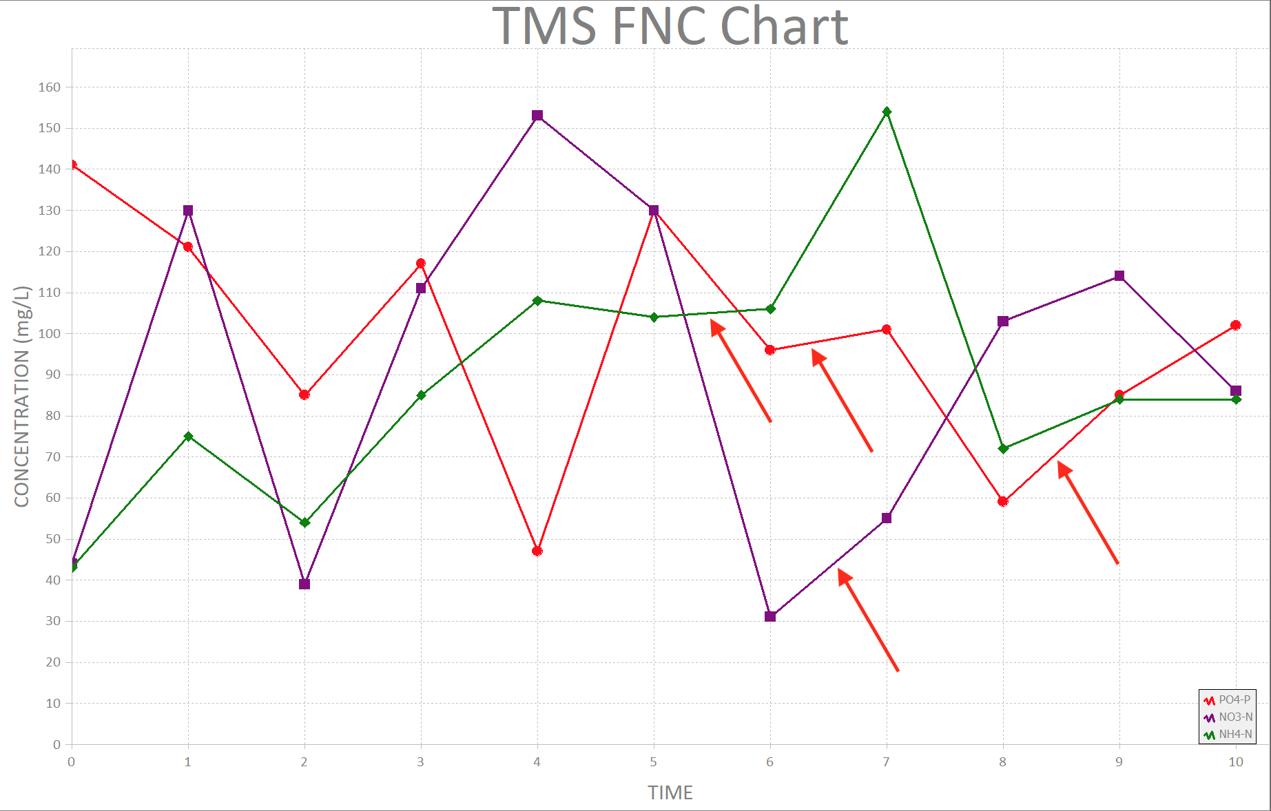
For comparison, I am attaching two demonstrations that we created in High Charts and TeeCharts. The lines in these charts appear to be smoother even when very zoomed in (in the TeeChart demo, you can zoom in on a chart by clicking and dragging your mouse in the chart).
Highchart.html (162.9 KB)
Teechart.html (252.2 KB)
Second, if you look at the TeeChart and High Chart demos I have attached, they have some very nice features like showing the annotations for series points when you point with your mouse; or how a series thickness changes to become more "bold" on mouseover. Is this type of event-based formatting available in FNC Charts?
Third, for viewing "big data" time series, the following interactive "master - detail" views for time series are very useful and engaging for users. From what we can see, FNC Charts do not currently have this level of functionality. Can you indicate if this is something on your development path? We are currently using TMS Webcore to leverage our Delphi code into our web application, and we are hoping that we don't have to try and include Javascript-based tools like TeeChart or High Chart into our code. FNC Charts is less development effort for us, but we won't be able to use it long term if it does not evolve in its features.
https://www.steema.com/files/public/teechart/html5/latest/demos/index.html