Yes, I realize. The idea is that you're just adding an element, and whatever you put in there is up to you. I've added a project (the project from the Basics 3 post) with an extra bit with a slider in it. here's what it looks like. Colors are just to show where the boundaries of the control might be.
I used a later Swiper library, but it likely doesn't matter much, this usage has been part of it for a long time. This needs to be added to the Project1.html file or your equivalent. A version of this library is added to your project automatically if you add a TWebImageSlider to your page, for example.
    <script src="https://cdn.jsdelivr.net/npm/swiper@8/swiper-bundle.min.js"></script>
    <link rel="stylesheet" href="https://cdn.jsdelivr.net/npm/swiper@8/swiper-bundle.min.css">
The idea is that you create a bunch of slides and then initialize the slider. The slider is just a TWebHTMLDiv on the page, so you can size that or do whatever you like and the slides should fill up whatever space you have. Lots of ways to customize how this looks and works. But just trying to get you started here. The TWebHTMLDiv contains HTML that lays out the internals of the slider.
    <div class="d-flex flex-column w-100 h-100 overflow-hidden">
      <div class="order-2 swiper w-100 h-100">
        <div class="swiper-wrapper w-100"></div>
      </div>
      <div class="order-1 swiper-button-prev" style="left:-50px;"></div>
      <div class="order-3 swiper-button-next" style="right:-50px;"></div>
    </div>
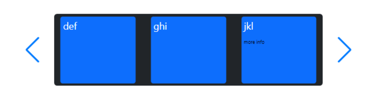
The slides themselves can be created out of thin air if you like, or include references to images or anything else. Here, I've added an asm block to WebFormCreate to get the ball rolling. The slides are constructed in a manual way here, but you could construct them via any other means- no end to the options for you here.
  asm
    var slides = '';
    var slideprefix = '<div class="swiper-slide" style="display:flex; justify-content:center; width:125px;"><div class="p-1 m-1 bg-primary text-white rounded" style="width:125px;">';
    var slidesuffix = '</div></div>';

    slides += slideprefix+'abc'+slidesuffix;
    slides += slideprefix+'def'+slidesuffix;
    slides += slideprefix+'ghi'+slidesuffix;
    slides += slideprefix+'jkl'+'<span style="font-size:8px; color:black;"><br/>more info</span>'+slidesuffix;
    slides += slideprefix+'mno'+slidesuffix;
The slides are added to the element using this, but again lots of ways to do this.
divSwiper.firstElementChild.firstElementChild.firstElementChild.innerHTML = slides;
And then this is what initializes the control. Tons of options can be passed in here, including things for generating additional UI elements like thumbnails or those little navigation circles that appear under sliders sometimes. In this case, we've set the "slidesPerView" to be auto, meaning if the control is wider you'll see more elements. Other options are to just show a fixed number, an option to loop when you get to the end, and so on.
    // Create the main slider
    const swiper = new Swiper('.swiper', {
      slidesPerView: "auto",
      spaceBetween: 5,
      navigation: {
        nextEl: '.swiper-button-next',
        prevEl: '.swiper-button-prev',
      }
    });

  end;
Hope that helps?
Basics3Slider.zip (53.3 KB)

