I modified the demo for the responsive grid to get the formatting correct. The grid looks good in the demo. However, when I transfer to my web application the formatting is not correct. I copied over the styles defined in the html file. Any ideas what is missing. The font size is not correct, and the text does not wrap.
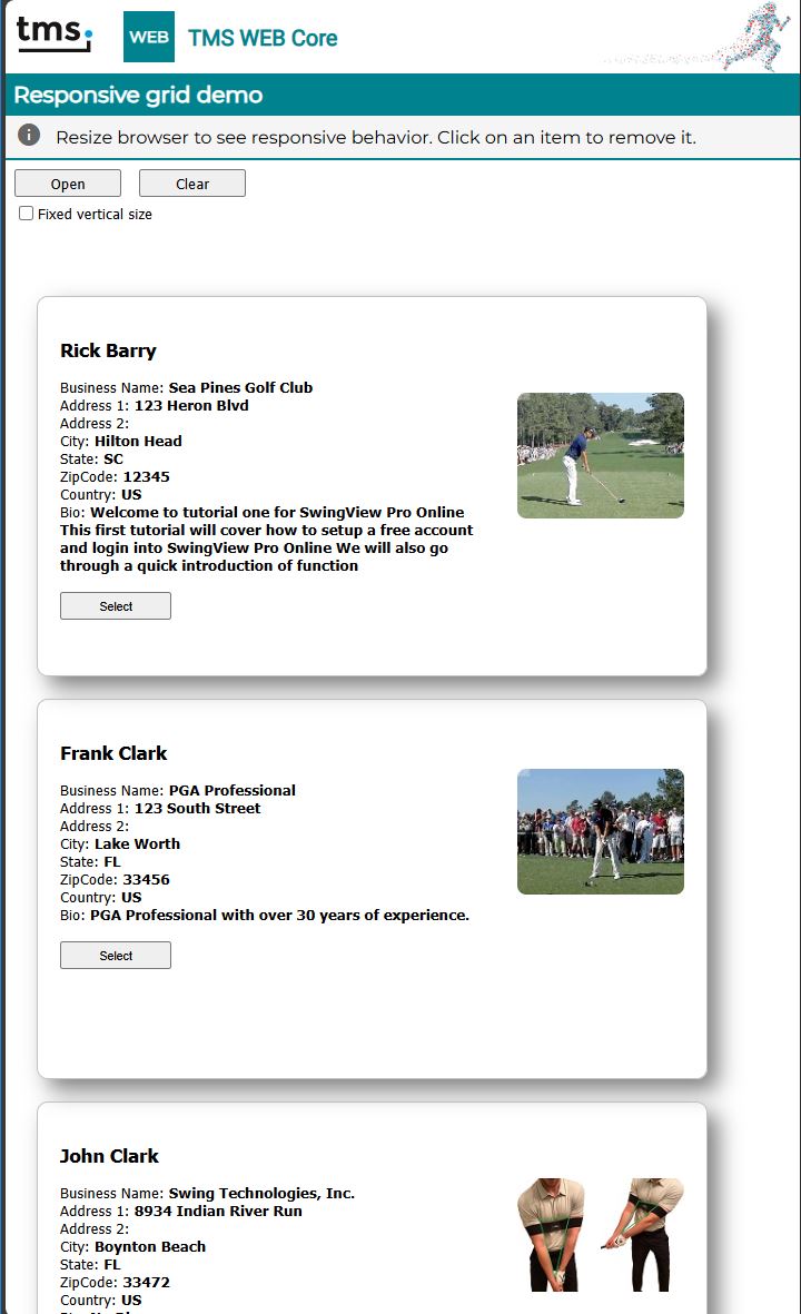
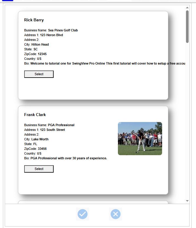
See the images for the difference.
Demo:
App:
This is the HTML for the item.
> '
> <div style="display: flex; align-items: center;">
>    <div style="flex: 1;">
>       <p style="font-size: 125%;"><b>(%firstname%) (%lastname%)</b></p>
>       Business Name: <b>(%businessname%)</b><br>Address 1: <b>(%address1%)</b><br>Address 2: <b>(%address2%)</b><br>City: <b>(%city%)</b><br>State: <b>(%state%)</b><br>ZipCode: <b>(%zipcode%)</b><br>Country: <b>(%country%)</b><br>Bio: <b>(%bio%)</b><br><br>
>    </div>
>    <div style="margin-left: 20px;"><img src="(%image%)" alt="Profile Image" style="max-width: 150px; height: auto; border-radius: 8px;"></div>
> </div>
> ';
> ```