I've asked holger, but sadly he doesn't have the source code for that video anymore.
We have an example of chart report here: Charts (Delphi) | FlexCel Studio for VCL and FireMonkey documentation
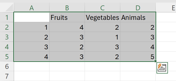
But the main issue with charts is that when you have real data, Excel normally creates the chart right automatically. The algorithm is simple: The dimension with les data (columns or rows) are the series, the other is the data. For example, I have here a chart of 3 columns by 4 rows:

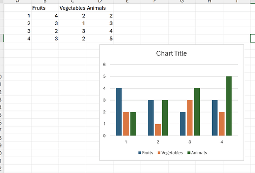
If you create a chart here, Excel will use the "fruits/vegetables/animals" as series, because they are only 3, and the rows for the data:
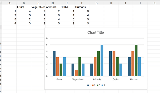
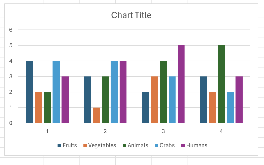
If we now add 2 extra columns, and create the chart again, now the series will be the rows (because they are 4) and the data points the columns:
Note how the legend now has the rows, not the columns.
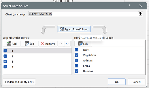
When you are creating a chart from a template, it is normal that the series/data points are swapped, because you don't have that many points yet. You can change this by right clicking the chart, selecting "Select data..." and then press the button "Switch Row/Column":
After pressing the button, you''ll get back to having the columns in the legend:
Now, the main thing about a report is that by default it won't add series, only data points. (you can add series, but that is more advanced, and I want to stick to the simpler case).
So if you are adding data in rows, make sure that your series (what you see in the legend) are the columns. Otherwise you won't get the desired results.
Sometimes it makes sense to start with a lot of dummy data (enough so it has more rows than columns), then create the chart and then remove the extra rows and replace with <#tags> Because when you create a chart in Excel, it deduces a lot of stuff from the data types, like if to use a column for the axis name, etc. So it might be simpler to start with "real data" for the chart, then remove the rows and add the <#tags>. And remember that by default we will only expand the data points, not the series. That's also what you normally want.
