Hi,
Is there any way of stopping this being ablo to be dragged left and right on a mobile device? Width is set at 100%.
Thanks,
Ken
Hi,
Is there any way of stopping this being ablo to be dragged left and right on a mobile device? Width is set at 100%.
Thanks,
Ken
Curious what the official response will be, but this is what I've got in my project's main html header that seems to help:
<meta name="viewport" content="width=device-width,initial-scale=1,minimum-scale=1,maximum-scale=1">
Hi Andrew,
Thanks for your input. That makes no difference I'm Afraid. I embed different forms in a container and it only happens with the one that uses the continuous scroll.
Regards,
Ken
Getting browser behaviour to bend to your will seems to be more of an art than a science. I just kept throwing things at it until it started to cooperate 
Some other ideas that might work, or might lead you to something else that might work:
Adjusting the background CSS:
background-attachment: fixed;
Positioning:
  top: 50% !important;
  left: 50% !important;
  transform: translate(-50%, -50%) !important;
Using the viewport dimensions assigned to elements:
#pnlMenu {
  height: 100vh;
}
I've also found that adding 'important' everywhere, while annoying, often seems necessary. Also, looking at the page through the browser dev tools (F12) usually helps to pinpoint what is wrong, so try experimenting there first and then add whatever works to the CSS. But you probably know that already 
I agree with you. It is only on mobile devices that I have a problem.
Hi,
This cannot be reproduced with a TWebContinousScroll dropped onto an empty form, so the issue most likely comes from the way you embed it.
Can you provide a small sample that reproduces the behavior you see?
I have sent a project to support via email.
We've received the sample project.
Both on desktop (Windows with Chrome browser) and on mobile (Android & Chrome browser) I can drag the screen a little bit to the right and then to the left.
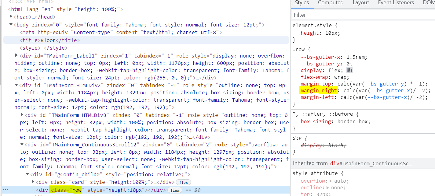
However this seems to come from the applied Bootstrap in your item template:
When you uncheck/delete margin-right, the horizontal slider disappears. A quick search about Bootstrap's row class shows the following, so it's not an issue with the TWebContinuousScroll component.
Thanks. I have tried every option I can think of to remove the right/left margins but with no joy so far. I have also tried putting the row inside a container.
Adding the following CSS rule to your project HTML fixed the issue:
.row {
   margin: 0px !important;
}
However this might cause unwanted behaviour. The suggestion from Bootstrap is to use a container wrapper around row classes, so I modified GetTemplate the following way, which also worked here:
'  <div class="container">'+
'    <div class="row no-gutters" style="height:100%;">'+
//the rest of the template
'    </div>'+
'  </div>'+
'  <div class="card-footer d-flex flex-nowrap" style="height:'+IntToStr(hPanel)+'px;">'+
//...
'<div class="container"><div class="row" style="height:10px"></div></div>';
It's a matter of figuring out the proper CSS settings.
Thanks very much Tünde, that's perfect.
For the record. Using a container around the first row works fine on a mobile but on a PC it centers the card.